PuK Gaming
Brand Identity & Packaging Design
Overview
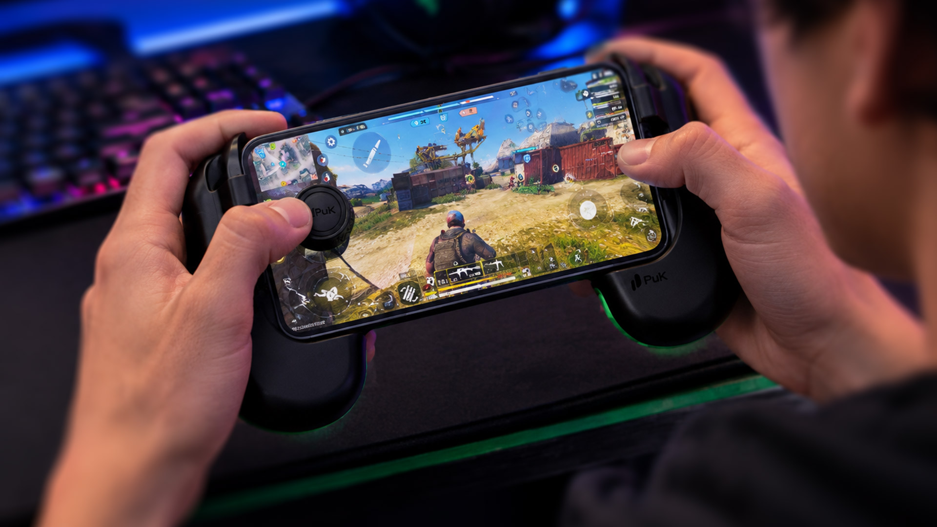
PuK Gaming entered the mobile accessory market with a clear mission: elevate the tactile experience of mobile gaming through precision-engineered controls. The project required a cohesive design ecosystem spanning visual identity, ergonomic grip concepts, and a distinctive packaging solution that stands out in a saturated hardware landscape.

The Challenge:
Mobile gaming accessories often suffer from generic design languages, clunky ergonomics, and over-engineered, plastic-heavy packaging. PuK Gaming needed an identity and product experience that felt sleek, modern, and high-performance, while ensuring universal compatibility across diverse smartphone models.
Design Strategy & Execution
Visual Identity & Isotype
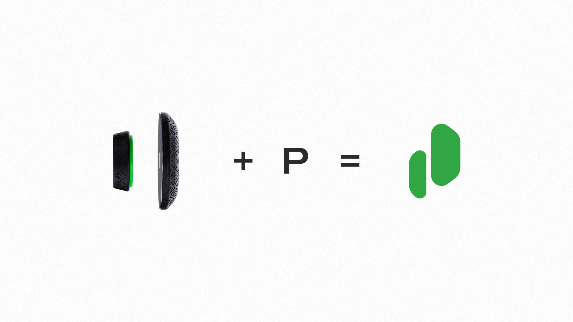
The brand mark represents the physical essence of the product. By abstracting the lateral profile of the PuK joystick components, the logo forms a dynamic icon where two overlapping geometric forms visually reconstruct the brand name "PuK".
Isotype Abstraction: Directly derived from the side view of the joystick mechanism.
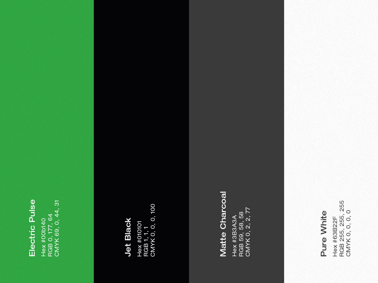
Color Palette: High-contrast electric green paired with deep matte charcoal to emphasize precision, energy, and modern tech aesthetics.
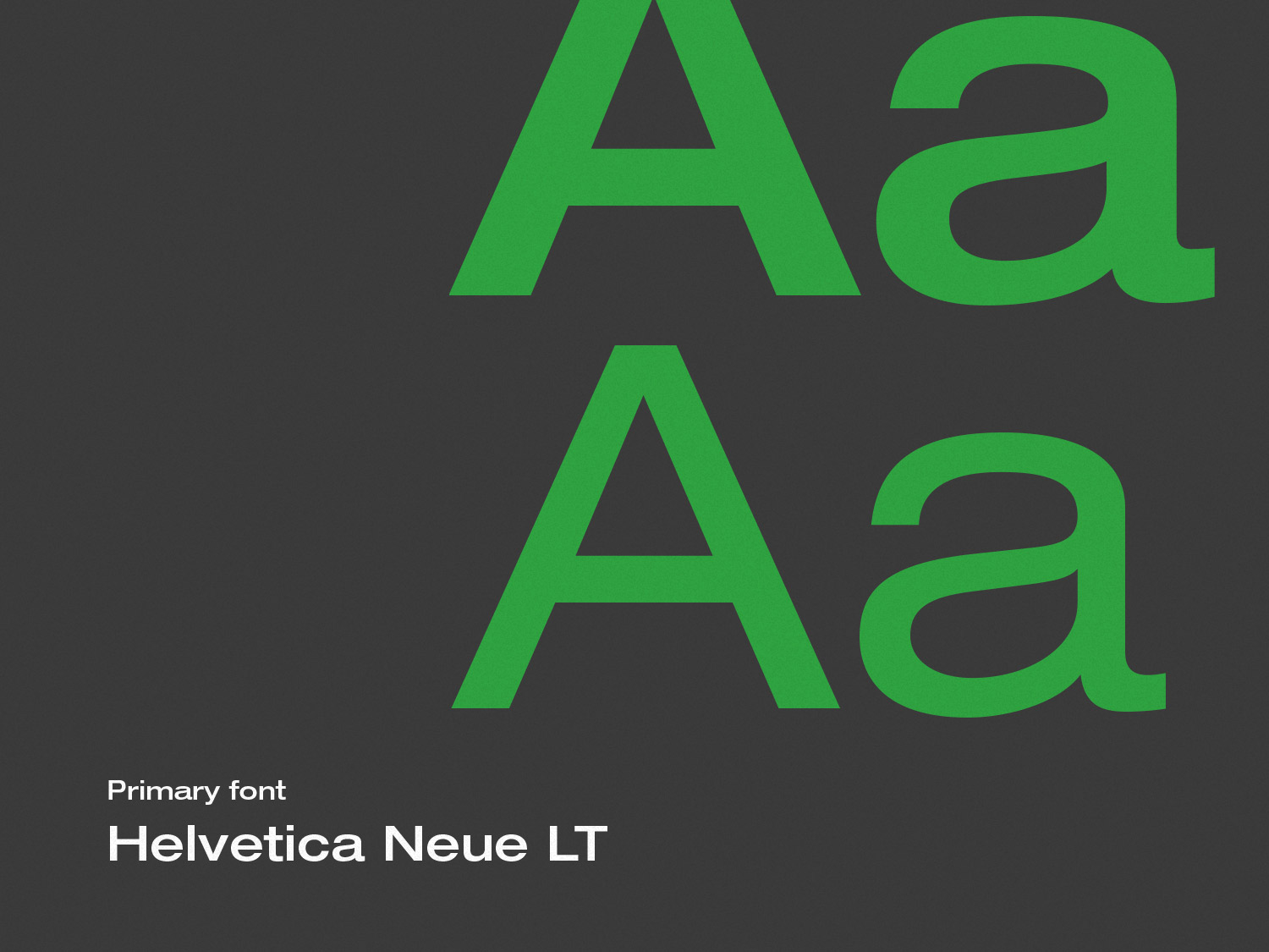
Typography: Clean, geometric sans-serif balancing modern tech sophistication with high readability

Sustainable & Minimalist Packaging
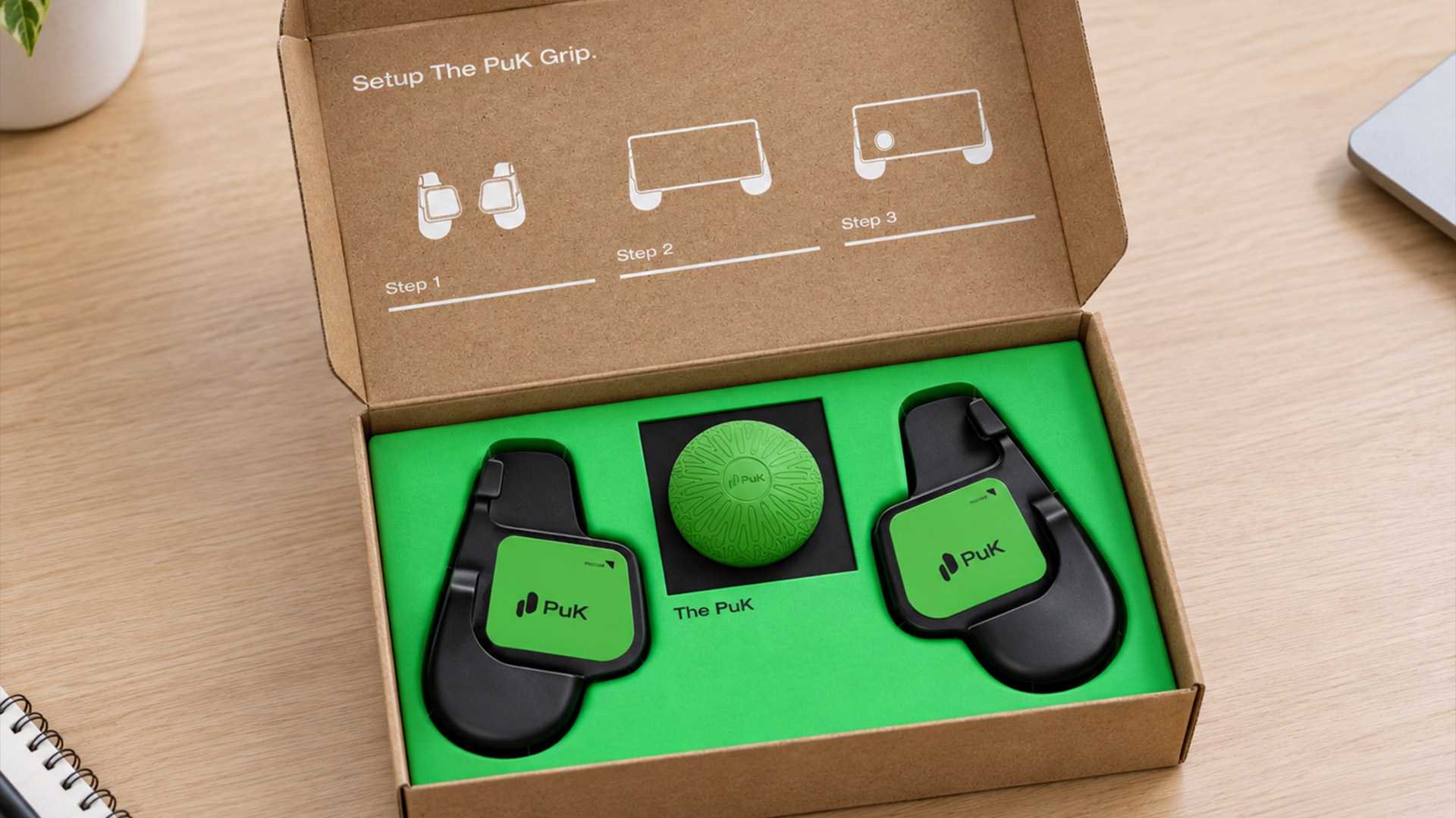
To break away from traditional visual clutter, the packaging design relies on contrast, texture, and structural simplicity:
Material Contrast: Raw Kraft paper textures paired with sharp, high-contrast dark faces and vibrant electric green top accents.
Typography & Hierarchy: Subtle, large-scale black typography ("THUMBSTICK") wrapped around dark panels for an understated premium look.
Functional Modernity: Direct integration of dynamic QR codes for instant digital onboarding and support, keeping physical print minimal and focused.

The Result
A unified design system that bridges physical product design and visual identity. PuK Gaming delivers a clean, high-performance brand presence—from the first glance at the packaging to the tactile feedback of the controller in hand.